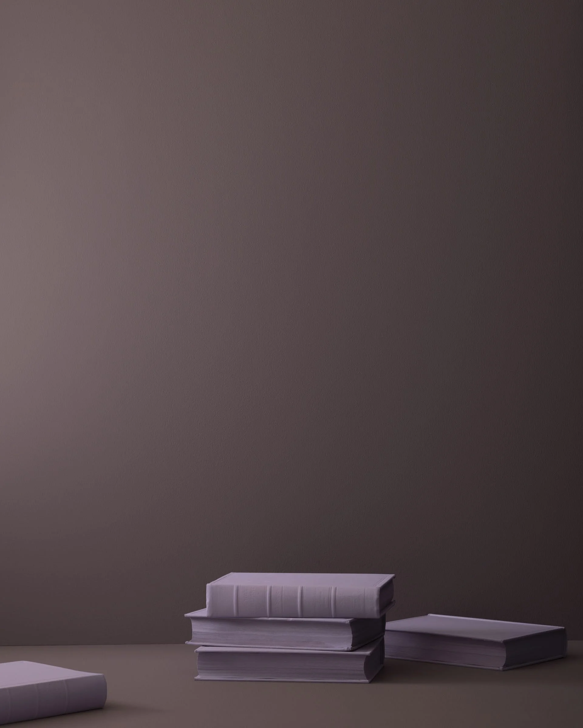
The Best Muted Benjamin Moore Colors
Hear ye, hear ye - the first real autumn morning arrived today and I genuinely could not be happier. My soul feels vibrant and alive today, and my hopes and dreams are in the forefront of my mind. It’s a great way to live. Of course I will be miserable by noon when the temperature approaches 80 degrees and the sun is scorching the earth and my poor, hermit skin. So it seems a good idea to write this post while I’m still chipper and chilly.
I’m starting to designate my Fridays for administrative work… I’ve gone so far as to block off my Google calendars as “out of office”, although I doubt anyone will notice. I need at least one weekday to work on all of my non-work: updating the website and shoppe, writing the blog, crafting Instagram posts, looking for inspiration, and chipping away at the book I’ve recently decided to write. Because why not?
Considering that our world in the Northern parts of the US are about to burst into color, I found it fitting to make this post all about color. My work is often described by myself and others as neutral, and honestly this is how I like it. I find neutrality to be rare and needed in our chaotic times. However, we live our lives in color, and I can’t quite bring myself to encompass total neutrality, as it seems to lack some invaluable ingredient, like a roast chicken without herbs.
So I wanted to share my favorite colors from Benjamin Moore. If you’re a client of mine, you’ve heard me say (probably more than once) that Benjamin Moore is best for color, and Sherwin Williams is best for neutrals. A blanket statement, but generally the truth! Here they are:
Brush Blue
2. Dry Sage
3. St. George Red
4. Vintage Wine
5. Stained Glass
6. Sea Glass
7. Fallen Leaf
8. Lichen Stone
9. Jungle Canopy
10. Gilded Ballroom
11. Mexican Hot Chocolate
I think I’ll leave it there! I’ve covered all the major color groups, and at some point too many options is hurtful rather than helpful. In this next year I’m expecting (as are most other designers) a burst of color in homes. We’ve been neutral for so long, however, that it’s only natural we test the waters with muted, laid back colors first. In America it isn’t super normal to cover your walls in warm tones, so if you want to be bold I highly recommend choosing a hue of orange, red, or yellow for your next project!
Until next time,
Nicki


