My Design Process | Layout & Sourcing
Hello readers! Been a while again. I think it’s time for me to accept that I am not the kind of person who can rigidly stick to a long term schedule…
Time has been passing so quickly lately - like one of those dreams where it’s the day of the final exam and somehow you haven’t attended a single class and don’t remember anything that happened. Tell me I’m not the only one who frequently dreams of losing large amounts of time? I guess I could consider “life passing you by” as one of my deep, dark fears.
Business-wise, things have slowed down a bit in the past few weeks as a few of my smaller projects are wrapping up, yet it feels as though I’m busy every moment of the day. Decision fatigue is probably one of the most common job-related ailments as a designer (seriously, a large scale renovation requires thousands of decisions) and I have been trying to combat it by engaging in activities that relax and inspire me.
Baking has always been a side passion of mine, and lately I’ve discovered two incredible things:
The Great British Bake Off
Flour, Water, Salt, Yeast by Ken Forkish
I honestly can’t even describe how much joy these two things have brought me this past month, and I consider myself to be pretty adept in the descriptive arts. If you have any interest in baking I highly recommend checking them out! There’s just something about the act of dough and pastry making that makes me feel so connected to our collective past. Pillsbury has put us sorely out of touch with our roots, and it’s been grounding and humbling to explore that missing experience.
Anyway! On to this week’s post, where I’ll take you down the winding road that is at the heart of the design process. For the sake of clarity, I’m calling this “Layout & Sourcing”. While it encompasses many different elements, those are at the core.
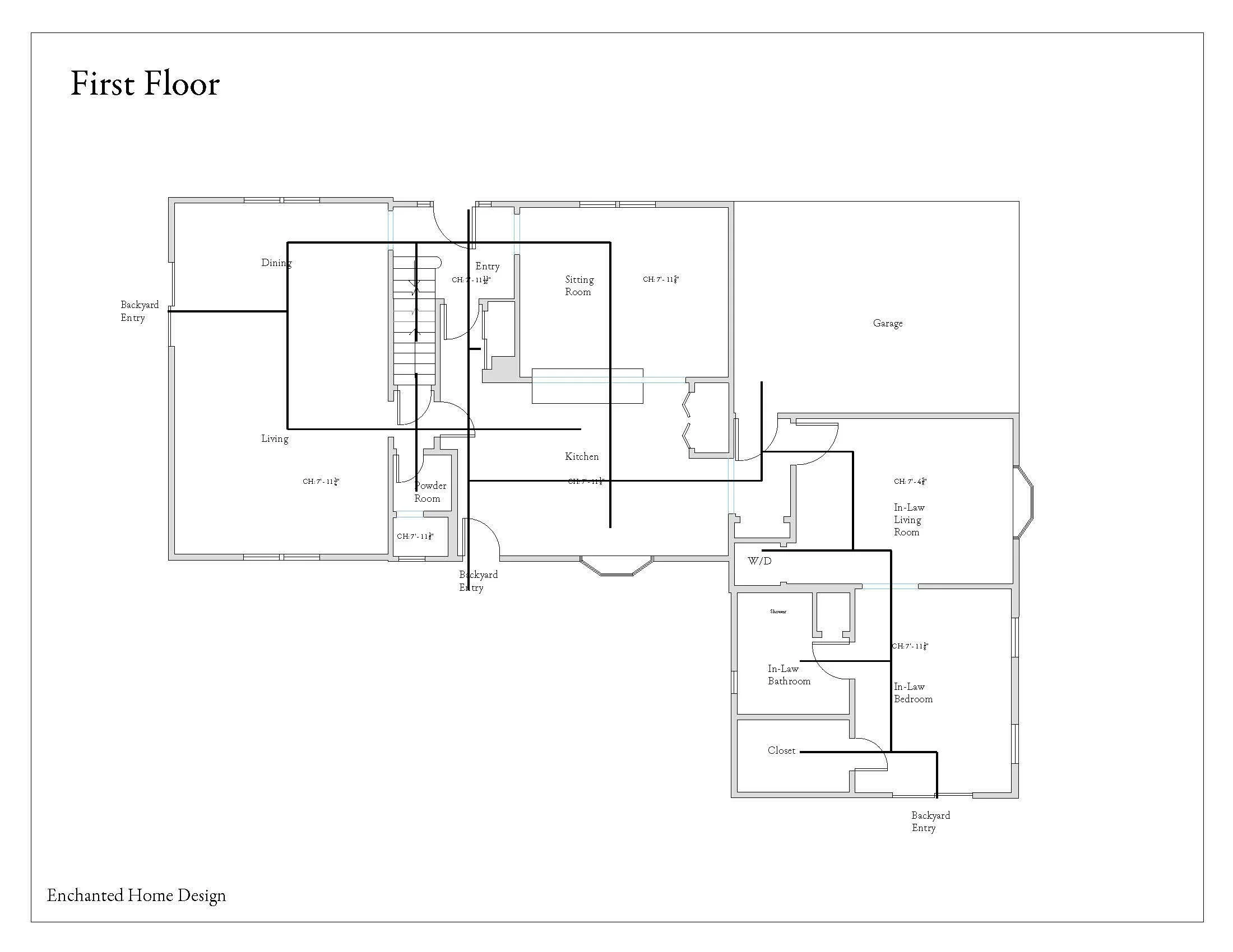
Layout refers to the floor plan, whether it is the entire house or just one room. This is where we use the drawings from the surveying portion of the process (blog post on that here). In a renovation, we will typically look at removing/moving/adding walls, as well as any plumbing or electric that follows those decisions. For a decoration or re-decoration project, the walls will remain as is.
As we’ve been following along on the Montebello House project, I’ll include the base plan for the first floor. This was the result of the survey. Nothing has yet been changed from the existing structure.

The base plan, or existing plan.
There are lots of twists and turns, tight spaces, and unnecessary doorways. The flow is actually quite nice despite those things, and the house sprawls in a very inviting way. I remember being there for the first time and constantly saying to myself, “Oh! Another room!” I do love when a house feels like a lovely garden stroll, rather than a series of rooms plugged in like a mathematical equation. I strove to minimize any excess movement patterns, while still maintaining a sense of intrigue as you make your way through the home.
Below is a really basic circulation diagram for the first floor of the house… feels a little overwhelming, right? The black lines indicate a path you would walk to get to another part of the house, or to the backyard. This plan allows you to walk right in the front door, through a closed-off hallway, and right out to the backyard. While in theory that’s a nice idea, it creates a main axis that avoids traveling through any of the actual rooms. That can make the space feel disjointed, or even unwelcoming.
Very basic circulation diagram.
After feeling out the undesirable chunks of the existing plan, I then take into account everything the homeowners are asking for. These clients wanted a more open feeling and wanted additional pantry space, potentially a laundry room, and a mud room. While that may have been a tall order for another home, this one had plenty of square footage to work with. The new owners wouldn’t have need of the in-law suite, only a guest room, so that became the perfect space to experiment with.
After a few iterations (it’s rarely, if ever, a one-and-done deal) and review meetings with the clients, we settled on a plan we all loved. It involved removing the existing pantry to create a fully open kitchen. The sitting room will become the dining room, thus giving the living room only one purpose: living. We’ll open up the walls in the in-law living room, and install a door to separate it from the kitchen.
The hallway across from the front door will become a coat closet on one side, and walk-in pantry on the other. We’ll demolish the existing island, move the kitchen door from the left to the right side of the plan (so we can run cabinets along that wall), and replace the bay windows with something larger and more modern. FYI - that is not a decision I took lightly. If the bay windows were integral to the home’s charm, I would have urged the owners to keep them. The mid-century style of the house actually clashes with those windows, and does the exterior a disservice. It also does not offer a very grand view of the stunning backyard!

The mostly final new layout, featuring text in a random font that AutoCAD decided was great and I can’t figure out how to change.
I really love the new layout. As you’ll read about in a future post on the construction process, anything and everything can change from this phase to the finish line. Clients change their minds, I notice something I missed, the construction crew finds something damning, the budget is tapped out, something is out of stock when we need it, etc. It’s very hard not to get attached, but we have to remember that design is a highly collaborative process and subject to all kinds of challenges. I find I’m constantly mourning the way I thought a project would go. But the end result is always beautiful!
Now that the new layout has been roughly determined, we can take a look again at those circulation patterns:

A basic circulation diagram for the new layout.
See how much cleaner it is now? There are still plenty of interesting paths to choose from, but there is a clear path for every direction. There is quite a bit of research on path finding and the human brain, much of it is beyond my scope of understanding, but one key aspect I noted was that clear, defined pathways actually free up clutter in our brains. It allows them to run more smoothly and become more at ease with our surroundings (this is paraphrased from research I did in grad school for the design of an addiction treatment center… maybe one day I’ll stop being lazy and find those sources for you).
Now that we’ve gone through the layout, it’s time to focus on the other half of this step: sourcing. While sourcing in theory means finding the pieces, fixtures, finishes, and hardware that we’ll use in the project, in this early stage nothing is quite set in stone. I do find some specific aspects (like paint, lighting, and kitchen stools) straightaway, but I also am still including general ideas. This is because construction materials like countertops, floors, and cabinets will vary depending on the contractors and professionals we choose to work with. I find it’s better to keep things vague in case they have to change. You’ll see what I mean below - some things have been pointed out specifically, while others are left open-ended, like “oak cabinetry”.

What I’m picturing in the kitchen at this stage.
Much like the initial mood board, I present these design ideas in a collage fashion so that we can see them all together. It’s a bit easier to get a sense of the mood and aesthetic this way. I also focused on the laundry room (which has since been renamed the “scullery” and I couldn’t be happier):

Early sourcing ideas for the laundry room/mud room/scullery.
The client loves color, especially jewel tones, and the scullery is where I started to work in some of the elements that I drew from their inspiration. I proposed keeping the kitchen neutral, so that it could act as the glue between other, louder spaces. Additionally, the best view of the backyard is from the kitchen windows, and I wanted to draw in as much of the lush greenery as possible. Black, white, and wood tones all make outdoor greens more dramatic, and almost pull them indoors.
Now that this post is wrapping up, I’m realizing that it only really illuminates renovations - it doesn’t make things very clear for those of you interested in redecorating only. So I’ll be creating a post to explain that as well!
Next up in the series is Elevations and 3D Renderings, which is another portion of the process that I’m forever enamored with. I can’t wait to share it with you.
Until next time,
Nicki