11 Design Ideas for Spring 2022
With spring right around the corner, I find myself desperately longing for days spent with a soft breeze rolling through the windows, filling the house with fresh air that invigorates and refreshes. While we wait for those beautiful sunny days, I thought I would put together a guide with some design ideas for spring. Every year the trends change slightly, and if we rely solely on them it can feel overwhelming to create a lasting space. I find the best formula is mixing old, tried and true pieces in with the new. Below you’ll find a blend of classic themes along with things that are new to today’s styles (but have roots that far predate our contemporary designs).
If you’re looking for inspiration for the coming season, or just want to day dream about it, here are some lovely ideas:
1. Wallpaper
It should come as no surprise to anyone who knows me that wallpaper would make this list… it is such an incredible way to transform a room. For spring, I would focus on florals and soft colors. They will breathe life into your space all year long, and cheer you up during the dreary winter months.
Linnea Green Garden Wallpaper from Sandberg
Raphael Light Blue Wallpaper from Sandberg
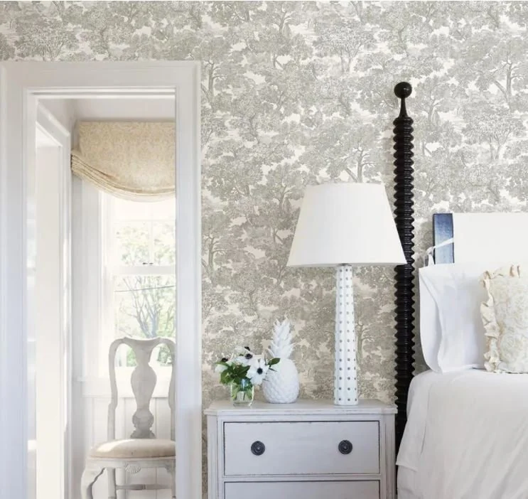
Chesapeake Grey Toile Wallpaper from Home Depot
2. White Lighting
This is something that feels very new to me. It reminds me of the first time someone told me about skinny jeans… I immediately wondered why anyone would want something so strange and new. Although it has roots in mid-century modern design, all-white lighting is going through a rebranding period. I feel especially tempted to use it in a space with white walls, or with one of the wallpapers above. It feels fresh and elegant, and I get the feeling it’s just getting started.
PS - can you tell that McGee & Co is my absolute favorite for lighting?
Gaya Chandelier from McGee & Co
Snowdonia Chandelier from McGee & Co
Torch Linear Chandelier from McGee & Co
3. Light Grey Textiles
While light grey fabrics have been saturating the market for the past decade, that doesn’t mean they need to feel stale. Using grey the right way is of the utmost importance, and it will make the difference between a room that feels stark and void of character and one that feels light, refreshing, and inviting.
While we may not all have a view as perfect as this, it provides a very important takeaway: grey and green are a match made in heaven. If you have a window in your home that has particularly green views during the spring and summer, it could be the perfect spot to incorporate light greys. Curtains, roman shades, bench cushions, or larger items like sofas and area rugs can all create that beautifully refreshing earthy scene.
This post from Jenna Sue Design (my go to girl for all things DIY) shows us another great way to use light grey upholstery. Layered between weathered, rustic pieces and the black fireplace, these chairs feel like the perfect thing for this space. Grey has the ability to nestle in between other, stronger elements to create a more cohesive look.
This image, besides being my dream bedroom, serves up my favorite way to style light grey: with deep, rich wood tones. Throw in olive green curtains and that beautiful black chandelier and you simply cannot go wrong. The textured bed blanket adds SO much, yet it doesn’t feel like the strongest design element in the room. It sets the stage and kicks back to let everything else shine. We see you, light grey.
4. Glass
Seems like a weird thing to include on a list of fun design ideas, right? We naturally have glass everywhere in the house, from windows to kitchen cabinets. It’s the intentional use of glass elsewhere, in unexpected places, that we’re talking about here. In Feng Shui glass represents water. If you are interested in incorporating the elements in your home decorating, this is an excellent way to do so. I spent a lot of time by the water as a child, but I rarely see it now as an adult. I like to use it as a small reminder of something I love.
This kitchen by the extraordinary Jake Arnold incorporates both milk glass and clear glass in the light fixtures - something I’m not sure I’ve ever seen done quite this way. Too much clear glass can quickly feel haphazard, and the balance in this image is just astonishing. One great reason to use clear glass light fixtures is if you have a beautiful finish or view that you would like to remain uninterrupted, like the lovely ceiling here.
Never NOT sharing this kitchen by Sean Anderson. Here we see a balanced light fixture - with the clear glass offsetting the heavy, weathered metal. Without the glass bottom, these lights would feel almost ominous in the space, and might not be visually comfortable to sit under. We also see in this composition the way in which glass interacts with natural materials. Wood, stone, concrete, and plaster are all enhanced by the introduction of glass.
In this staged scene from Amber Interiors, they have used glass in arguably my favorite way… as knick-knacks! A little vessel here, a vase there. It serves as an additional natural material that you can add to your home’s palette. Especially in contemporary homes, where natural materials are absolutely key in creating a lived-in feel, glass can elevate just about any space.
5. Vintage Inspired Floral Prints
This is another trend that has been everywhere lately, and I just can’t get enough of it. Using grandma’s floral patterns in a reimagined way really does it for me. It’s a nod to grandmillenialism that can fit into anyone’s style or budget.
This pillow from Danielle Oakley Shop is what neutral, floral dreams are made of.
Obsessed with this quilt from McGee & Co… hoping to use this for our guest bedroom!
These curtains from Pottery Barn are slightly modernized with the use of curtain rings, a great way to bring something more traditional into a contemporary home!
6. Polished Nickel
Brass has been “in” since I started my design career, and boy was it everywhere. Don’t get me wrong, antique brass is still my favorite finish, but now we’re slowly seeing the incorporation of other metal finishes too. I’ve seen gorgeous kitchens that mix brass cabinet hardware with nickel faucets so expertly that I question why I would ever use just one metal ever again. I find polished nickel to be exceedingly lovely these days. It has that fresh, clean air about it that’s perfect for spring.
An elegant sconce from McGee & Co.
This picture light in polished nickel is so damn elegant. Just make sure whatever it’s lighting up below jives with the silvery finish.
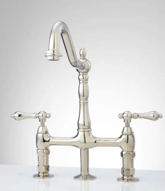
I can’t wait until I find a client who wants a kitchen faucet like this one from Signature Hardware… I’ll just be over here manifesting.
7. Hazy Landscape Art
I know you’ve seen it on your favorite influencer’s posts about their home… hazy landscape art is *so* hot right now (maybe even hotter than Hansel). Is there anything better than a soothing, abstract landscape painting in all of your favorite colors? Probably not honestly. What I found difficult was exactly where I should be looking to buy them from. Luckily, targeted Instagram ads are very good to me and sent me some great sources. I really hate having to dig through hundreds of pieces that are not my style, so when I find a place that feels curated, I am over the moon. Here are 3 that I find extra swoon-worthy.
Collection Prints has a pretty limited, but ultra-refined selection of artwork. They almost exclusively have landscape art like this, named La Jolla. They feature different size options, framing options, and digital downloads.
I have long term plans to use this painting (Irish Countryside) by Deb Presutto Fine Art in my primary bedroom. What blows me away is that these are her original paintings, formatted for prints and downloads. She is ultra talented and offers custom pieces as well. I always love supporting small, women-owned businesses!
North & Finch specializes in what I consider to be “cool-traditional” artwork… things that look cool in modern interiors but have a traditional feel. Their landscapes like this one are great, but their entire selection is just fantastic.
8. Dark Wood
It’s back, baby! For the past few years, dark wood was so absent it almost felt like a faux-pas to even use it. Light, natural wood like maple and white oak have ruled the design world for a while now. As with all things, trends are cyclical. I find dark wood’s re-entry to be such a refreshing change of pace… especially when paired with other things on this list. Wallpaper, polished nickel, white lighting, oil landscapes, light grey fabrics - the possibilities are endless!
GIVE ME IT. Give. Me. It. Freakin’ fabulous.
It feels so good to see some darkness on my feed again… and look how beautiful with that grey tile and nickel hardware.
If you follow me on Instagram, you’ll have seen this one before. Those rich wood tones with the black, white, and brass are utter perfection.
9. Penny Tile
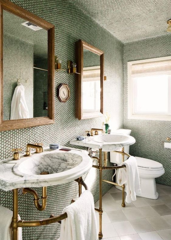
Did penny tile ever leave? 100% no. Still, to me there is something very fresh about them. Whether it’s white or black or colored, ceramic or marble, it’s so timeless. I guess it made the list because I get chills when I think about how great it looks with some of the other things on here. A forever classic.
SO Springy. Via the Lily Pad Cottage.
A totally different take from Studio MRS.
An adorable mosaic from Jenna Sue Design.
10. Built Ins
This is pretty much the #1 thing I focus on when trying to create a home that feels custom. Whether they are truly built in, or they are Ikea cabinets with Semihandmade doors, nothing feels more special to me than this type of cabinetry. It says, “Someone really put thought into this house and it’s a special place to live.” Why is it on this list? Basically I just felt like it. I’ve been working on this post for 4 hours and I don’t really have the energy to make something up…
A wildly special room by Becca Interiors.
This kitchen design by Kelsey Leigh Design Co makes me so happy to be a designer. The little things like this cabinet are what make this job really amazing.
A gorgeous mudroom by Amber Pierce Designs shows us that functional can be so beautiful. And what a great way to tuck away all of the crap you don’t want everyone to see!
11. Vintage Furniture
Especially since newly made furniture has a lead time of 8,000 years, vintage furniture is the THING right now. Facebook marketplace, Chairish, AptDeco, Ebay, and local antique shops all offer previously loved goods that will turn your house into a home. One of my fave design studios, Light and Dwell, sets a percentage for each project for vintage furniture. Their spaces always look so curated, lived in, and comfortable. Of course new things are lovely, but without old things I find their impact to be lacking. We’ve furnished almost all of our home with used goods (to save money), and it feels so much better than it would if we had filled it with new, cheap things.
It’s stupid how perfect these chairs in Julia Marcum’s dining space. I literally have drool on my face.
One by Light and Dwell Interiors… this space would not be the same without the addition of that vintage stool. It adds so much personality.
Another one by Light and Dwell… such a talented pair they are. The juxtaposition here is astonishing.
Well I have just about had it with my longest-ever post. I hope this gives you as much inspiration as it does me.
Until next time,
Nicki


